Bukoo’s Waddle
Bukoo’s Waddle is a philanthropic initiative focused on supporting those in need. The name comes from the idea of a “waddle” of penguins—symbolizing community, warmth, and moving forward together.
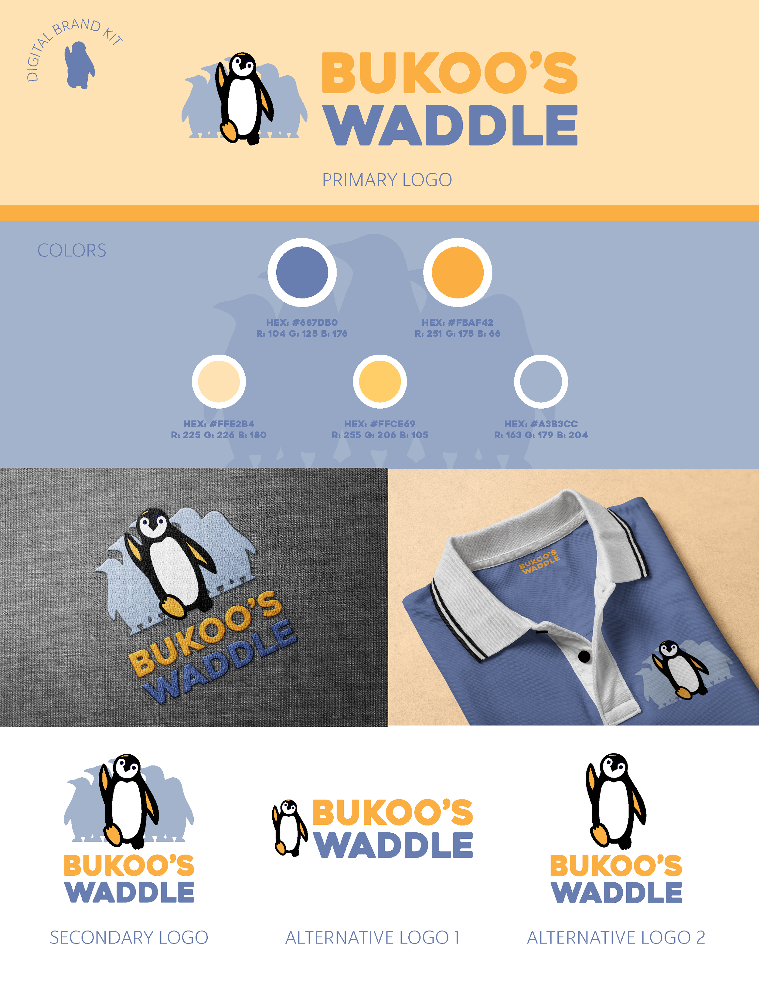
The goal was to create a flexible, personality-driven brand identity centered around a single penguin character, Bukoo. The design needed to avoid harsh, arctic tones and instead lean into warm, welcoming colors that would translate well across swag, print, and digital.
Through early concepting, we explored different poses and styles for Bukoo, eventually landing on a version with one foot stepping forward—symbolizing progress. A secondary variation includes a group of softer-toned penguins following behind him, reinforcing the theme of support and community.
The final deliverables included multiple logo variations, a simple brand color palette, and both color and monochrome formats for easy application. The result is a playful, heart-led identity that’s ready to grow alongside Bukoo’s mission.
This project was completed at my time at ASH Interactive.